We can submit at least two.
Quilt 1: Eternity
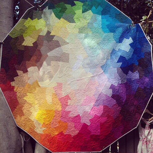
--
Quilt 2 is a question mark right now.
My options are:
1. Crooked Summer Sampler
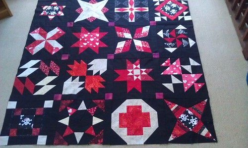
I'd submit this one mostly just to imagine their faces when they receive the submission.
2. Santorini Sun And Sea
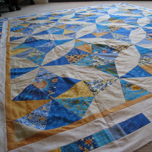
I like this one, it's been finished for a while, and all I have to do is get it backed and quilted, which I could do myself, easily enough.
3a) I <3 Kona - without borders
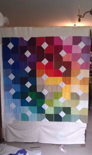
Latest work, up on the design board now, trying to work out if I should just go borderlerss like this or...
3b) I <3 Kona - with borders
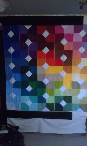
The black border is pretty dramatic. Not sure I want to go with it - a better option would have been a range of subtly tinted 'blacks' - alas, for I cannot find my Kona Colour Card and so I don't even know if they have that.
I thought the border would give an opportunity for the colours to really pop - but black looks like it blends too well into the dark colours, and would just make the light ones really obvious.
Your thoughts? On the quilt choices, on the borders/no borders, on the whole submission in general?

I have to say I love the black borders. I think they really make the colors stand out and the fact that some of the darker colors blend a little bit is okay to me. Personally I think it's lovely with the border, but it would still look great without. Have you considered a charcoal grey border? I know Kona carries one and it wouldn't be so dark. It might be a good in between option.
ReplyDelete